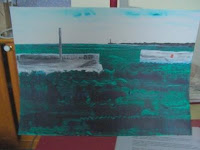
I thought I was going to hate this painting. It started with enjoyment – the wonderful Pthalo green and Pthalo turquoise, a touch of violet and Prussian blue too, used with a credit card: swishing movements mixing it up and squiggling to create the stylised deep sea effect. The
 concrete sea walls with a gateway for who-knows-what, the simple sky so typical of a hazy dry day – and then I left it to dry and to think about.
 Soon it struck that me that this was an entrance. The title played into my mind, “This Way to Land”, and in the distance would be a lighthouse on a slim dark headland. I wanted colour and I could visualise the lifesaver hanging on the wall, and a speck of red on the lighthouse.

PROBLEM: the focal point (lighthouse) was so central – even though it was where I wanted it in relation to the opening in the ‘harbour wall’ and to the distance – that the picture appeared to need to have a third cut off its width to decentralise it!
I stood well back from it and thought long and hard. ‘Resisting realism’ is something I put into my ‘Artist’s Statement’ when there’s enough space and it doesn’t make it too waffled. I want to resist realism but capture the character of a place or situation.
I stood well back from it and thought long and hard. ‘Resisting realism’ is something I put into my ‘Artist’s Statement’ when there’s enough space and it doesn’t make it too waffled. I want to resist realism but capture the character of a place or situation.

Sea walls are inclined to be clumsy and ugly with strangely hefty items built into them so when it ‘felt right’ to add height in the form of a heavy grey pole to the left, that seemed to work okay.
But I still hated the picture.
It’s at this stage that one wonders why paint at all? One thinks the object is worthless and would screw it up and go buy a dress or a cream cake . . . but I’m not a teenager and I know this stage in a painting too well: it just needs a little something to lift it a cut above the ordinary.
I wanted more red, somewhere near the pole. Or should the pole be thinner? Should there be a rope on it like a flagpole?
I hunted around in my workroom for something red, a piece of cardboard or fabric, to temporarily stick in place to see if it was going to solve my compositional problem. I found just the thing: a scrap of cellophane paper from which I cut a small square and I stuck it to my painting using only its own static! I could try different places to decide whether it was going to be akin to a flag, a light box, a dog litter bin or something else.

The red paper only needed two positions before I knew exactly where the red patch belonged and when I came to paint it in I felt that the outline was quite enough anyway. It looked more realistic.
And then from nowhere came the two birds.
Now I’ve gone and fallen in love with this picture. Soon you'll be able to see and BUY the finished thing on http://www.affordablebritishart.co.uk/ I can’t wait to see it framed and hung in somebody’s lovely house.
Now I’ve gone and fallen in love with this picture. Soon you'll be able to see and BUY the finished thing on http://www.affordablebritishart.co.uk/ I can’t wait to see it framed and hung in somebody’s lovely house.
No comments:
Post a Comment